As I’ve mentioned a few times, I’ve started my own business. Part of the fun of starting a business, for me at least, is the graphic design needed to create a brand identity.
There are many things that constitute a brand identity, including the name, logo and brand colours. Choosing a name is probably the hardest part, and I’ve worked through many iterations to get there.
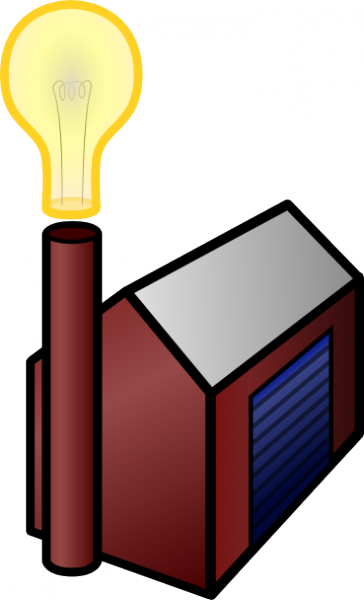
I liked the idea of the brand being based around building or creating something. At the time, ‘Killer Idea’ seemed to be playing on my mind so I toyed with the name ‘Killer Idea Factory’. This was also partly inspired by the Icon Factory.
The first interpretation was very literal, and the logo was far from a good idea. Logos should be clean, simple, and identifiable when printed in a single colour.
Another version attempted to use typography, and failed miserably.

However, after this the ‘Cog and Bulb’ design was born.

As you can see, the first version of this idea was in full-colour. Full colour logos rarely succeed, as they are limited in their use. They don’t scale down well, and are not easily adapted to work with different colour pallettes. However, I thought I was onto something I would eventually use, so now it’s a matter of refinement.
The first refinement was to simplify the design.

Then add some colour, and try to start deciding how to integrate the name.

The version above looks very busy, and unbalanced. The next attempt was to even it out by making a horizontal version.

That works better, but the name is ludicrously long. Perhaps including the name within the bulb might make things a little more compact?

Ok, it’s getting there. But it’s still not what I would consider a professional image.
Let’s try changing the typeface.

Wow that’s dull. The loss of colour probably doesn’t help, and neither does the choice of fonts.
The next 3 iterations toy with different landscape layouts and 2 different typefaces.



At this point I decided it looked a bit static. Cogs tend to need to turn in order to be of any use, so the next challenge was to try and get movement involved (without animation).

Now that looks stupid!

Bingo! A 45 degree rotation does the job. It also looks a little like a ‘Q’, not that doing so is really of any interest.
So, now a few more close iterations:



Now, I’ve found a typeface, a graphic and colour pallette that I like. But I was still not sure about the name. Time for a rethink.
Eventually, of course, I ended up with Idea Cog. This actually works in many different ways:
- it’s a literal interpretation of the graphic (and vice versa)
- it suggests innovation as well as production
- quite aptly for the first product, it could also be interpreted as facilitating the development of ideas (i.e. a cog in a company)
There are some disadvantages to this name, such as the lack of domain name availability. There are some squatters, and some genuine users of the same name in other countries. However, on the balance of it, I decided that this name worked well and shouldn’t cause confusion with other organisations with the same name.
So, after a few minor tweaks, I give you the official logo for Idea Cog:
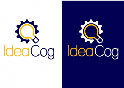
Incidentally, all of these were created in SVG format (vectorised) using the fantastic Inkscape.
I have to say that some of your early attempts were utterly terrible but the end result is really well executed – it was really interesting to see your thought process. The cog and the lightbulb are especially well done – my only small criticism might be that the type spacing is a little tight (especially between the ea and og).
There are also some on paper somewhere, which pre-date the first one shown above. Might dig that out too, to show how even worse the original ideas were!
I’ve used the font straight out of the box, it probably could do with a little adjustment kerning-wise.
David, I took your criticism onboard, and now I’ve adjusted the spacing between the offending characters, just as I was designing the business cards that would be a permenant manifestation of the finished article. Thanks 🙂