KillerLight v2 is here!

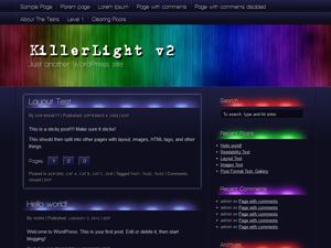
Yep, after far too much procrastination, the successor to my first WordPress theme is here.

It has taken a week of evenings to convert it from a layered Photoshop design into HTML and CSS. The previous version of KillerLight was based on the code of the K2 theme, and ended up being heavily customised. This time around, version 2 is based upon Thematic and very little in the way of HTML changes has been made – just a few more wrapping divs here and there. This should lead to a very robust theme.

Gone is the animated header background, at least in this version. It caused far too many complaints and confusion, although I still think the idea is sound provided the animation is subtle.

I’m going to submit the theme to WordPress.org’s themes directory soon, and once approved (fingers crossed) it should be easy for people to find and install into their WordPress v3 site.

More information can be found on the Idea Cog website, where information about the theme is being hosted.

EDIT: Until the theme is available on wordpress.org, you can find a download link on this post.

KillerLight theme released

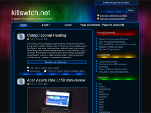
KillerLight screenshot

My first WordPress theme, KillerLight, has been released on wordpress.org. The theme is a slightly altered version of the one used on here.

Like this site, it has a javascript-based animated header which fades slowly for a lovely faux-lighting effect. All current WordPress features are supported, including widgets and gravatars.

One important thing to note about the theme is that IE 6 is not supported – it’s just not worth the effort. Instead, a message is displayed to users of IE < 7 informing them that they should either upgrade or get a different browser.

KillerLight improvements

If you haven’t noticed already, I’ve made a few improvements to the KillerLight theme.

  • There is now a JavaScript-driven header animation, which has the ability to detect a slow computer and disable itself. You can turn it on and off manually with the button at the top-right.
  • A few more icons have been added here and there
  • The ‘read more’ link is now styled
  • The footer can expand vertically instead of being fixed height

I’ve taken a look at it in IE6, and it’s not as badly broken as I feared. At the moment the animated header screws things up royally, and the top horizontal navigation doesn’t display horizontally. I hope to at least get things looking reasonably presentable soon, by disabling the animated header for IE6 and changing the way the top nav is styled.

As for a future release of the theme, it’s all planned out in my head. A non-branded version of the header images will be included, so anyone can have that fading animation. The name of the blog will be overlayed in standard text.

I also have a few ideas for spin-off themes, which are a slightly different take (new graphics) on the same structure. Watch this space!