DUOS June 2008 poster design

The brief for this design for Durham University Orchestral Society was something that fitted in with Shostakovich’s Symphony No. 5, composed under the watch of the communist state in which he lived, whilst surreptitiously incorporating musical ‘messages’ that the outisde world could spot.

DUOS Poster for Shostakovich\'s 5th Symphony

Due to illness and a very busy period at work, the designs were a little rushed but I think they came out well in the end. It’s an adaptation of an original propaganda poster (if you hadn’t guessed).

iPod remote control interface mockups

Here are some initial interface wireframes for the iPod Touch remote control. I’ve not shown all of the menus because that would be quite a bit of work. These three should give you an idea of what I intend to do though.

Main menu

The main menu summarises the major systems of the house. Clicking on one of the buttons takes you to more controls for that system. The colour of the buttons indicate the overall state of the system – green = OK, yellow = warning, red = error, grey = disabled.

mockup-main-menu.png

Audio

The audio controls will list the 4 zones, with a drop-down menu next to each button to select the audio source. Clicking the large button switches the zone on or off. Pressing the ‘Use for all’ button copies the settings of the selected zone to all the other zones.

mockup-audio-menu.png

Security

The large buttons display a thumbnail of the live video from the cameras. Clicking on the large button will show the full video feed (resized to fit the iPod’s screen). Cameras can be disabled for privacy.

mockup-security.png

DUOS posters

DUOS approached me several months ago and asked me to produce a poster for a concert in Durham Cathedral. Apparently they liked it so much that they’ve come back and asked me to do 2 more for some concerts in December 🙂 I’m not a professional designer, but it’s nice to have a go at designing something that’s not a website.

The first poster:

DUOS Poster - 17th June 2007

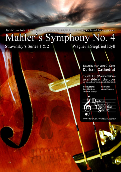
This design was based around the theme of the main piece of the concert – death’s fiddle striking up.

First design for concert on 1st December:

DUOS Poster - 1st December 2007 (Version 1)

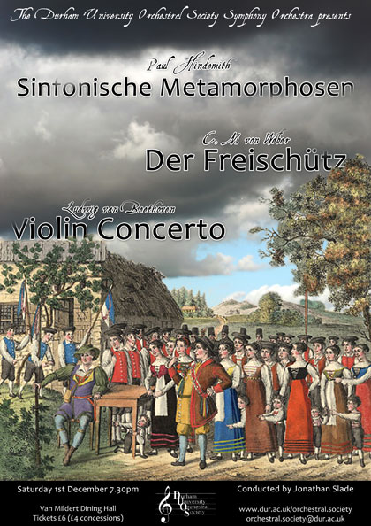
This one was inspired by the only reasonable artwork I could find for one of the pieces. The original was landscape, so I had to take some liberties with Photoshop and apply it over the top of a photo. While the result was ok, it wasn’t particularly easy to read and was very busy. This design was dropped in favour of the one below.

Second design for concert on 1st December:

DUOS Poster - 1st December 2007 (Version 2)

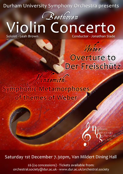
Much simpler, going back to the violin cliché. It does the job.

Poster for concert on 6th December:

DUOS Poster - 9th December 2007
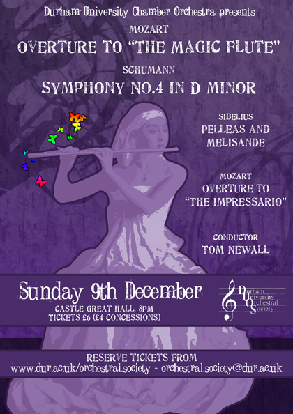
This one was inspired by a tutorial, although I didnt follow it to the letter. I’m afraid I can’t lay my hands on the link at the moment, but I StumbleUpon’d it, so click that Stumble button a few times and you might find it!